 My sister-in-law J and I took a break from sheltering in place during the pandemic days, and decided we'd
  stay socially distant but explore some of the murals in Atlantic City, New Jersey. (And yes, we wore masks, and washed our hands upon our return home.)
Atlantic City is known for the numerous casinos
 and the boardwalk. But the city itself has become rather run down over the years, and with some of the social problems that often happen in low-
 rent areas: landlords who don't keep up the properties, crime, gang activity, drugs, and so forth.
 So the Atlantic City Arts
 Foundation decided to do something similar to what Philadelphia has done - hire regional artists to create murals throughout the community, allowing landlords to volunteer their property for a mural. In many cases, the artists also work with groups of teens to paint the murals. (The great part about involving teens in the mural making is then they feel ownership, and are way less likely to vandalize or graffiti over the murals.)
Murals are my favorite public art form - they beautify an area, help people feel proud of their building and their community, and they convey some kind of positive message. How can any of that not help a community feel uplifted?
So, a few things before I add photos and talk about the murals we found - there are currently over 50 murals that have been created as part of the 48 Blocks project. The original plan was to have murals on 48 blocks of the city, but it seems to have grown.
The website for 48 Blocks Atlantic City includes an interactive map to help you find the murals - enlarge the map and click on the mural markers for more information:
https://atlanticcityartsfoundation.org/48blocksac
I found a website set up by a family who has visited nearly every mural, so you can see more murals:
https://www.jerseyfamilyfun.com/self-guided-atlantic-city-murals-tour/
An article on the youth involvement:
https://www.pressofatlanticcity.com/news/local/atlantic-city-youth-given-second-chance-with-arts-program/article_09d54629-3ffe-5514-9093-9c2a75bb8ee9.html
And an article about one of the artists at work:
https://www.shorelocalnews.com/atlantic-city-arts-foundation-continues-to-brighten-the-city-with-new-murals-during-covid-19-2/
 Okay, murals! "Personal Space" by Charles Barbin
A mural painted by Charles Barbin, the artist
 featured in the article above, is on a wall shared with another mural, which I'll talk about in a minute. This is a looooong wall, maybe 75 feet
  long and 9 feet high - and "Personal Space" is probably about 50 feet long, give or take 10 ft. (So the wall is maybe 25 m long, 3 m high - the mural being possibly 16
  m or so.)
All of the photos from the beginning of this blog post to the description of this very cheerful mural are part of "Personal Space."
So you have a tightly packed but brightly colored cityscape against a sunny yellow sky. Superimposed over the city and sky are power lines full of birds. Each bird, and each human, is carving out their own personal space. And yes, this mural was completed very recently - the article was published on 24 April 2020, during the self-isolating that was mandated here in New Jersey and much of the USA.
We see the birds, and presumably the people in the city, all keeping their distance in our era of social distancing and sheltering in place. Hence the title, "Personal Space."
One of the features I like is how the artist, Mr. Barbin, painted his mural so it looks almost like a sheet of paper peeling away from the mural to the right. So that the viewer realizes that while these two murals share a wall, they are two different murals. And this, the more recent mural, is either peeling away or possibly being pasted down over the earlier mural. I just thought that was a wonderful way to give the feeling of transition from one mural to the other.

 "Person Space" shares a wall with "Greetings From Bungalow Park" by Glenn Taylor. This is a lovely and
  vaguely nostalgic mural featuring painted postcards of Atlantic City and the South Jersey Shore.
 There's also a map of this part of the city
 quietly in the background, so that people know where they are and what this neighborhood is named.
The map and postcards are superimposed over a view of the land, one or two buildings that are presumably some of the original bungalows built here, and the calm sea of a summer day. Atlantic City was once a summer home community for wealthy people who came down from mostly New York City and maybe Newark, to escape from the city heat. People still own summer homes on the South Jersey Shore, but other people live here year round.
But this mural is a reminder of those summer bungalows and summer visitors.
Yes, there was a red shopping cart on the sidewalk. I used my foot to roll it out of my way, depending on the mural I was photographing. It was sort of funny. There were also people periodically wandering by, but they either said hello or just ignored me. I guess people here are used to the occasional mural tourist.

 Some murals are a collaboration by a few artists. The mural "All Signs Point to a New Horizon" by Mark Chu and Charles Barbin is an example.
Our best guess is that this is the old Atlantic City of hotels, motels, casinos, and neon signs. Bright colors, sunny days, lots of unseen tourists because they're either on the beach or in the casinos. But definitely signs signs everywhere.

 We found a mural painted on a retaining wall, and even with the map this mural is unknown. No names, no attribution. I'm thinking, based on the work, that this was done perhaps by a school group. Yeah, that's the art teacher in me. But this mural, while colorful and sweet, is not professional in composition nor technique. So I suspect this was painted either by a school group or perhaps a community youth organization. No idea, but I really liked the black Lab enjoying his day by the sea. Just a fun and carefree sort of a mural.
 While J and I had a printout of the map, it wasn't easy to figure out what mural was where. So she'd drive, and both
  of us would be swiveling our heads looking for spots of color that might indicate a mural. (The map makes sense if you have a tablet and can take it with you, staying connected to wifi and enlarging the map as you go. Taking a printout is not the best way to use the map, we finally realized.)
"Finding Your Way" by Bernie McCabe, Mazing Art Studio, is a crazy maze painted all over a building. Turns out the building is an employment business, so it makes sense that there is a start and finish, with various intersection and overlapping pathways between the two.
We all take our own paths through life, and somehow it's never a straight line, right? Our lives are like that maze, where we head out on one path, make a series of turns, maybe back up at some point and try a different turn. Eventually we find the job we love, or at least the job we can stick with for a while - or we find our soulmate, or where we want to live forever. Whatever it is we're looking for, it takes us on a twisting turning path to get there.
That's how I see this mural, anyway.

 "I've Gotta Be Me" by Glenn Taylor is fairly self-explanatory. Sammy Davis Jr. performed frequently at various venues in
  Atlantic City. He didn't grow up here, but he still is something of an icon in the city. And, as part of the entertainment industry in Atlantic City, it makes sense to have someone famous singing on a mural.
Also, the beaches of Atlantic City were once segregated. Chicken Bone Beach is the name of one of the beaches designated for African Americans. Sammy Davis Jr. frequented Chicken Bone Beach, up until desegregation was mandated by the civil rights laws of 1964. He's still a role model to this day.
And in a city that is now about 35% African American, well, it's got be powerful to see a famous African American person in a mural.

 "Dissent is Patriotic" by Sarah Painter & Cosby Hayes is a really enigmatic painting. It's a gorgeous mural, painted very
  realistically. A beautiful young woman is wearing a crown of seashells, and sits in front of a circle? The earth? Some kind of background filled with maybe corn stalks? Or kelp? Is she
  possibly underwater? She's holding a large conch shell that has the image of the Atlantic City boardwalk inside, and she's wrapped in the
  US flag.
How does one even begin to decipher the meaning?
A bit of online research reveals that this mural may represent Margaret Gorman, the first Miss America in 1921. Atlantic City is, of course, home of the Miss America pageant. And photos of the first Miss America show her at times wearing the American flag as a cape.
So perhaps this mural is a protest against the concept of beauty pageants, and women as only ornaments?
Maybe the meaning is that Atlantic City as a whole is not real - a city designed for the amusement of the rich and famous (today's 1%) - even though there are people living and working there, and catering to the wishes and desires of those rich and famous.
Turns out that the phrase "dissent is patriotic" is a riff on the quotation by historian and playwright Howard Zinn, "dissent is the highest form of patriotism." The shorter "dissent is patriotic" has also been used on posters from the American Civil Liberties Union.
I can't find anything definitive about the meaning of the mural. Maybe the title is to make us think, to wonder about this beautiful young woman who holds Atlantic City in her hands, wrapped in the US flag. Maybe she symbolizes our nation, all that is right as well as all that is wrong, no matter what side of the political fence we find ourselves.
No idea. As I said, a very enigmatic mural.

 Up the street and over one block from "Dissent" is "NJ Osprey Project" by Evan Lovett. This is a really lush mural - the central
  hyper realistic osprey has made a comeback in this part of the US, and nests at a wildlife sanctuary not far from Atlantic City. The osprey is framed by a swirling ornamental ring of lines that, to me, are reminiscent of the fileteado art style I learned and practiced in Buenos Aires.
And on the right side of the swirls, there are shining jewel-like circles of turquoise and blue, almost like the eye design on peacock feathers. If you look closely, you can see that these actually show fish swimming in the water. But in the top circle, you can see an osprey, a sea hawk, has caught the fish and is flying off with its dinner.
I don't have many photos of this mural - there was a fence blocking access to the area next door, plus there was some kind of police action going on, with a policeman entering the building, and the car with flashing lights parked out front. My policy in such cases is don't get involved. So I took a few photos and hopped back in our car, and my getaway driver got us out of there.

 The last mural we saw was "Family First" by Alice Mizrachi, but I'm leaving a more complex mural for last in this blog.
Meet the artist article: https://www.shorelocalnews.com/meet-the-muralist-alice-mizrachi/

This is a huge mural, taking up the entire side of a three storey row house. I'm not sure if there was a house taken down, leaving this window-free side to the house, or maybe an attached house was meant to be
 added on but never was. No idea. But it makes for an interesting space for a mural.
The artist, Alice Mizrachi, has emphasize that it's all about family and that a family makes a home - look at the
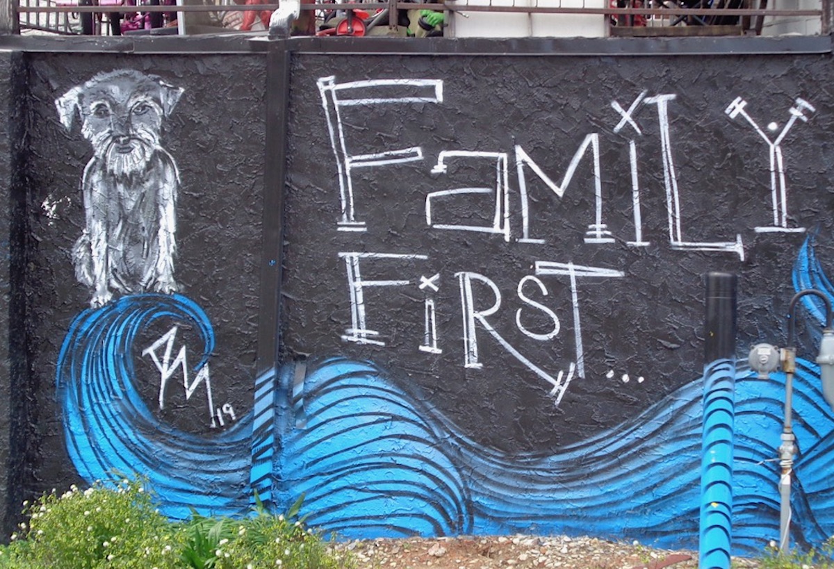 diagonal lines over the father's head, making a roof outline. This family fills the house, literally and metaphorically. And this is how a house becomes a home, by filling the empty building with a family full of love, relationships, nurturing, growth. And the dog, don't forget the dog.
I really like the strong rich colors of this mural, the basic crayon box rainbow colors of red orange yellow green blue purple. These basic colors add a deceptively simplistic look to this mural, an almost elementary school and child-like feel to it. But it really isn't at all, and symbolically it's very complex.
Dad is standing in back of Mom, providing a strong support for the family. Dad is holding up that roof. One child is on each side of Mom, who is pregnant. (Did you notice that?) One boy, one girl. But who is that man standing in front of Mom? A former husband? An uncle? Is he hiding from Dad? (I personally think he represents extended family, but who knows.)
Mom's hair is swirling around and enveloping the whole family - is it also water? Like rain nurturing plants so they can grow and thrive, to go on to eventually produce their own fruit?
The black outlines make the painting feel almost like a woodblock print. It's a strong image, with strong colors. For a strong family.

 I saved "Memory" by Kelley Prevard for last. It's a complex mural, with multiple parts. This mural is located on the exterior of the
  Atlantic Cape Community College, which is where my sister-in-law J teaches.
At the beginning, there's a signature block,
 and a blue background with scattered gingko leaves in gold. Stenciled over the top is a poem by Travis Love.
As the mural grows down the length of the building, there
 are three indented panels, each featuring a person or people. All are immigrants, all are painted like old black and white
  photographs, painted in black and white and shades of grey.
And all have brightly colorful symbols of who they are, where they come from, the heritage and culture that makes each person uniquely themselves.
In the background of
 each large niche, surrounding the persons, we have colorful stencilled or stamped patterns, almost creating a backdrop. Some are reminiscent of the fabrics from various parts of the world, others are
  more similar to batik or stamped walls.
Above these individuals, tying the mural together, is a pale blue panel with simple figures walking
 from left to right, living their everyday lives. Some carry luggage, others have shopping bags. A few push baby carriages or strollers. Single people, families,
  people young and old silently walk across the panels. Migrating from one side to another.
This one seems pretty obvious, right? We have the gorgeous woman whose ancestry is somewhere in Africa, with her braided hair and lovely beads and
 bracelets. The background is definitely similar to wax print cloth from West Africa.
The stately older couple in the center is also African, the woman's clothing
 is also wax print cloth. The background isn't as African in artistic style, at least from what I saw there. They have a very regal look, don't they? The way they both stand upright and strong, but joined together by their love for each other.
The beautiful little girl could be from a variety of places - Central or South America, Southeast Asia, some of the Pacific Islands, even parts of the Indian subcontinent and neighboring islands. But I think in this instance she represents Mexico, perhaps all of Meso-America. For two reasons - she has a monarch butterfly on her shirt, and
 while monarchs migrate throughout North America, they all migrate annually to the forests of Mexico. My second reason is that she has a mosaic halo around her head, and halos are a predominantly Catholic artistic symbol. So that kind of negates the Pacific and Indian Ocean regions as her heritage.
In my mind, I wondered why these people were all painted like black and white photos. They were surrounded by bright and colorful backgrounds. They wore colorful clothes or accessories or, in the child's case, a friendly hitchhiker. Why were the people themselves in black and white?
Or is this perhaps a visual pun, an artistic play on words? Maybe this is taking our very American view of the terms "black and white" to the ultimate limit of the words. Because have you ever really seen anyone who is as black as night, or ink, or ebony? No, people might be dark brown, but not jet black. And white? Have you really seen a person as white as snow? Or as white as a sheet of paper? Well of course not, white people aren't that white. They're more, well, beige. Or maybe tan.
Mmmm hmmmm. For the non-painters out their, we artists make beige paint by mixing brown and white. We make dark brown by mixing that same brown with a tiny dot of black.
We humans really are all some kind of shade of brown. For some reason, we call dark brown people black, and we call light light brown people white.
So yeah, I think this mural takes skin color out of the discussion. This mural focuses on culture, the culture we bring with us. The heritage that is our background, that surrounds us.
That maybe those are more important aspects of our selves, rather than the color of our skin.
That all of us are migrants to this country (other than our First Nations or Native Americans).
That we all have our memories of where we came from, where our ancestors came from.
And that the color of our skin is really pretty irrelevant to a camera. Why does it have to divide us or define us, instead of just being part of who we are? Why can't our smile, or our kindness, or our friendliness, or our helpfulness define us, rather than our place of origin?
That's what this mural says to me.
Thanks so much Phebe! So look forward to your blogs. Please keep them coming
ReplyDelete