11 October 2020
 I think I said in the previous blog that I've been in touch with people at the Department of Public Works here - they'll be the people who will put up the sign in the park. And the
  head (manager?) of Public Works has plans to put in new posts to hold the sign, including painting the posts the same color as the sign's background (Cape Verde).

Since I had an extra quart of the Cape Verde green to give the back one more coat, on Monday I offered to go over to the town on the mainland to give the Public  Works
guy the paint I used on the sign, so he can paint the new posts.
Works
guy the paint I used on the sign, so he can paint the new posts.
We ended up having a bit of a chat as everyone  else walked to their cars at the end of their day and headed out. Chip is a very
nice guy, and we talked about his plans for the posts and how to hid the screws used to attach the sign. He's the person who put up the old sign decades ago!
else walked to their cars at the end of their day and headed out. Chip is a very
nice guy, and we talked about his plans for the posts and how to hid the screws used to attach the sign. He's the person who put up the old sign decades ago!
We talked about ideas for the height of the posts - I just want to be sure any mowing doesn't damage the sign! Chip offered to do a little special landscaping around the base of the sign posts, and even wants to put in some azaleas around the side of the sign to make it a whole little fancy spot. I told him that I selected a pink based on some of the azaleas in the back area of the park, and he hopes to get a few to match that pink - my Jaipur Pink, though to me it really is Azalea Pink!

25 October 2020
 I don't know where the time goes - I didn't realize we were already beginning week #33 of this pandemic. Yikes!!
The sign  installation took place on Friday, 23 October. We had an email storm going back and forth between myself, Public Works, and Parks & Rec with dates, weather
  predictions, time, etc. I took the sign over to Public Works on Tuesday, so the crew could attach the posts and get the sign all ready for the installation on
  Friday.
Friday dawned foggy, misty, and drizzly. But we drove over the bridge to the park, and the crew was there, as well as two members of  the city council and LeighAnn, my contact at Parks & Rec. We all greeted each other and chatted from behind our masks. (I of course matched my mask to the sign.) The
  other women were smart and had umbrellas, but I claim Washington state residency so eh, a little drizzle is not a big deal.
So, the process: the PW crew had  been cleaning up the park all week. Old branches that had been broken in the storms all summer were sent through the chipper to make mulch which will be used to build paths
  through the park. Leaves were raked up. The old sign was removed, and a new area decided upon. Holes were dug for the new sign, and traffic cones were inverted into the
  holes so no one would injure themselves.
The sign was on a flatbed truck, and two men carefully took it off. They placed the posts into the holes, and  used levels to check that everything was perfectly horizontal and vertical - really, they used levels across the top and then on the posts to be sure it was all aligned! Then one
  man held the sign in place while the other guy mixed up a small amount of cement. Small shovelfuls of cement were dropped into the holes and tamped down, the levels
  periodically checked, adjustments made, more cement, more tamping - until the holes were fairly full of cement and the sign was stable. Then the excess dirt was
  stomped down by the crew, and the sign was fully planted.
Public Works did a great job with the posts for the sign - they used 4"  square wood (about 10 cm square) that probably was about 8 ft tall (2.4 m). I'm estimating on the height - the sign on the posts is about 6 ft tall, and it looked like maybe 2 ft fit
  into the holes in the ground (roughly 2 m tall and .66 m into the ground for our metric friends). The wood was painted the same color (Cape Verde green) as the sign, and then they
 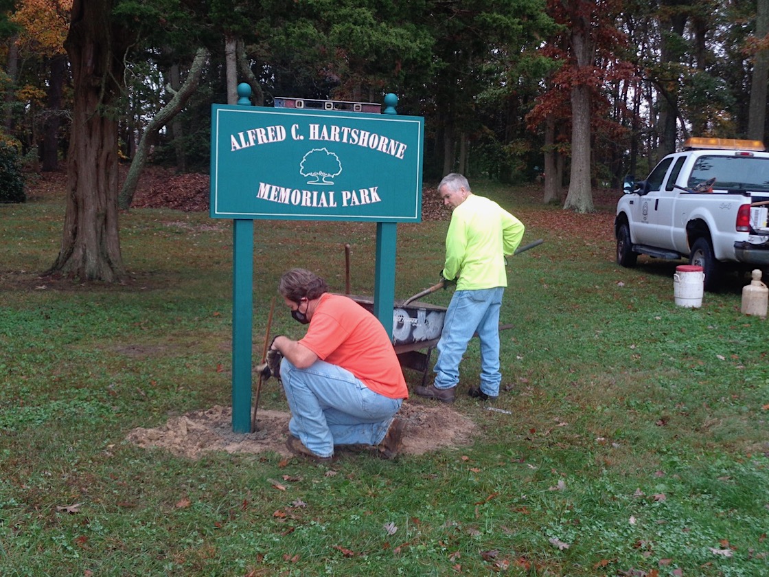 added ball finials to the top of the posts, which gives it a very finished look! It really is fabulous!!!
That was kind of it. No speeches or anything, which was nice - just a few officials, the work crew, myself with Richard, and S and J, our little family group. There were a few photos, but that was about it.
It was very low-key. That's the way I like it - we artists mostly prefer working behind the scenes, and we really don't want all the publicity.
But the two council members and the Parks & Rec lady thanked me more times than I could count. And while I do appreciate their gratitude, well, it was a fun project for me as well.
While I was introduced to everyone, including our very meticulous Public Works crew, I don't remember anyone's name other than the people I've been emailing. My apologies, but I somehow need to see a person's name in writing (or write it myself) in order to remember it. But big huge thanks to the two men who did all the leveling and cementing in order to plant the sign!
We had a conversation about the wildness of this park, that most of the trees are fairly old and the park has been left primarily in its natural state. There are a few sections that have floral plantings, and Chip would like to do something like that at the base of the sign. But the park is mostly grassy walking areas and benches to relax under the huge old trees.
So that's the grande finale of the story of the sign.
Oh, S, my brother-in-law, said I didn't sign my name. I told him that if I signed my name, it was almost like giving teens permission to graffiti their names on the sign. After twenty-five years of teaching middle school students, I've learned to anticipate the way they think - and any name on a sign is enough impetus to add their own.
So the sign shall be without the name of the artist.
I don't need the publicity. As an artist, for me the joy is in the doing.


