5 October 2020 - The Story of the Sign
Two weeks ago, I posted a little about starting to paint the park sign - here's a link to that blog if you want to read it: https://rollingluggagers.blogspot.com/2020/09/pandemic-diaries-week-26-27.html
But I should back up. We arrived in NJ in early April after we caught an embassy evacuation flight out of Lima, Peru, due to that country's shutdowns. We spent three weeks at a hotel to self-isolate, then moved in for a few months with Richard's brother and sister-in-law.
We would often take walks to the neighborhood park, and one day I commented that the sign not only was not in good shape, it was rather ugly. J, my sister-in-law, said we probably could make a new sign. We chatted about this with S, Richard's brother, who suggested maybe having a sign company make a basic sign that I could paint.
I pursued this; it sounded like a fun project for all of this sheltering-in-place time. I emailed the NJ state parks department, and they replied that the decision would rest with the local town's Department of Parks and Recreation. I tracked down an email for them, and after two tries I found someone in the office who replied to that email. She said it was up to the town council, and that it would help if I came up with a visual representation of what I was thinking of creating for this sign.
Well, this meant walking over to the park and measuring the existing sign. It was roughly 20" x 40" (or about .5 x 1 meter) so I thought okay, let's make it a simple 2 feet x 4 feet, or roughly .66 x 1.3 m. I taped together large paper, measured out and marked lines, and sketched my general idea for the sign. I sent it in to my contact at the Dept of P&R. She sent everything to the members of the town council, and they approved with one condition - the official name of the park was different than the name on the current sign, and they wanted the official name to be on the new sign.
Big sigh here. The official name, the Alfred C. Hartshorne Memorial Park, was much longer than the Hartshorne Park for Seniors. I wasn't prepared to redraw that entire sign, so I did a quick little layout on the computer and sent that in.
By now it was May, and we were all still isolating and sheltering in place. Non-essential businesses here in New Jersey were closed, doctor visits were either virtual or on hold, and the virus caseload was extreme in northern NJ.
So it took a while to hear back from Parks & Rec, since the office staff was working remotely and keeping in contact with the town council members via email. She eventually received full approval from all members, and gave me the go-ahead.
 Then it took a few more weeks before businesses began to open up. I finally drove out to a local sign company, choosing to help a local business rather than a national chain. I talked to a man who didn't do the graphic design work, but he took my info and my sketch, and said I'd get a call with an estimate the following week.
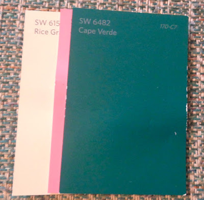
 Once I visited the sign company, I went to the paint store with a chip of paint from the back of the sign. I picked up several paint chip samples to match the color of the sign as well as the garbage cans along the bike path that runs in front of the park. I realize that it sounds funny, matching paint for a sign with garbage cans, but trust me, artists who design interiors for hotels, parks, malls, airports, etc. all consider everything, including whether the trash can color coordinates with the rest of their vision for the interior space. We do this to provide a more cohesive look. So, while the sign was a deep forest green, the garbage cans were more of a faded teal green. I selected Cape Verde green, which has the dark quality of the current sign but a bluer tone that matches the garbage cans. For the letters, I chose Rice Grain off-white with a faint greenish hue, and Jaipur Pink,
which is about the same pink as the azaleas in Hartshorne Park. (See how the pink brightens up the off-white and deep green?)
Once I had the estimate, I went in again and spoke with the young man who became my contact, Dante. (Prophetic, right? He definitely led me through the process!) He took my idea and input things into the computer, coming up with a better layout, better tree, and even a color mock-up based on my paint chips! I put down a deposit, okayed the new mock-up via email, and we were good to go!
Now, the modern way a sign like this is made is that the graphic designer does the layout on a computer. The design is sent to the production department, where they have a giant router machine that receives the design from the computer, or that is run by a computer. The machine can cut the shape if the sign is other than a rectangle, and it routers out the design. Most designs are either letters carved into the sign, or the space around the letters is carved out so the letters themselves are raised up. Usually if the letters are raised, there's also a wide border that is also left raised. And the background is often carved to look like wood.
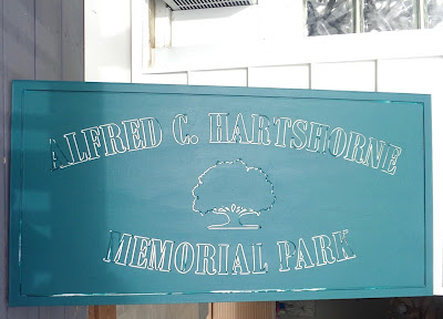
 But I wanted to have a green background with off-white letters, and a pink outline around the letters. We talked about making the letters stepped, so there would be a level for the outline and another level for the letters. The simplest option, though, would be to just carve out a channel around the letters and the tree, leaving the letters and the background at the same height as the basic material. That's what we finally did - a 1/8 inch wide (.3 cm) channel that is 3/16 inch deep (.47 cm) was carved around each letter and the tree. (I didn't want it too deep, but I wanted it deeper than it was wide.) And a 1/4 inch (.6) channel was carved one inch (2.54 cm) from the edge, to create a border.
 It was an unusual request, but Dante saw my vision. I have to add that it was a joy to work with a graphic designer on this, because not everyone can look at me holding up three paint chips as I say "I want a pink outline about this wide" and they say "oh, okay, an eighth of an inch." So as we're standing around talking through our face masks, we're speaking the same language of visual art. It always is wonderful to work with people who can see your vision. Especially since the other people I know here in NJ thought my idea of a pink outline was weird.
 Anyway, it took a while. The sign company had a huge project that came before my sign, and it took longer than anticipated.
 But then I got the call to pick up the sign, and it was beautiful!!! I liked it so much, I would have been happy putting it up just like this!
 On the same trip to the mainland (since we were living in Atlantic City by this time), I went and picked up paint and brushes.
Let the painting  begin! I thought I'd do all the painting of the large areas out on our balcony, and then the detail painting could be done inside because I'd need my reading glasses for that.
So lots of newspaper, a couple of low boxes to raise the sign up off the table, and messy clothes for me. I painted the primer first. The sign was  made of high density urethane, which is a little bit like highly concentrated styrofoam, so it soaks up a lot of primer. Several coats on the front and sides, while
  also trying to keep the primer from filling up the channels around the tree and letters. Paint-dry three times, flip the sign over, and three coats of primer on the back
  and sides again. That was day one.
Day two was the same thing, but with the green paint. And paint not only takes longer to dry than  primer between coats, it also takes a lot longer to cure, or become dry enough to be hard. As I wrote in the Week #26-27 blog, I had a chunk pull off the bottom of the sign when I
  stood it up for photos. So I ended up fixing that indoors, and waiting another week.
I chose to paint the off-white for the  letters. I couldn't decide if I liked the tree in green with a white outline, or as my original plan of a white tree with pink outline. I asked some people, and the majority preferred
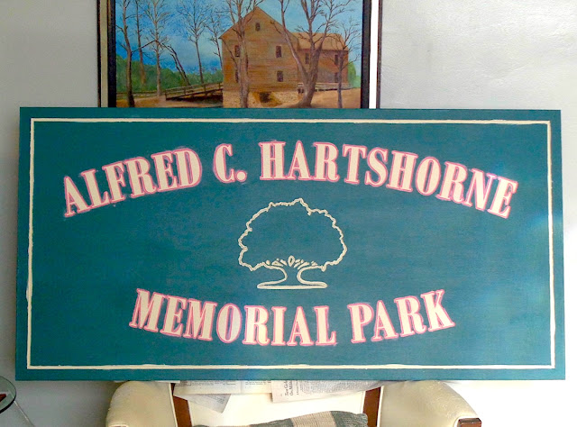
  the green tree, so I went with that. I painted a wider line around the channel, to emphasize the tree. And painted Rice Grain on the letters, as well as the border line.
Waited a day, and painted the pink outline in the channel around the letters. Unfortunately, paint store paintbrushes aren't art brushes, so the brush had to  be trimmed. And bristles kept splaying out, making smudges or smears outside the channel. I finally just left the smears and focused on filling the channels with Jaipur (or Azalea) Pink.
That meant another coat of Rice Grain on the letters. You can see the difference between the smudgy pink on off-white versus the nice clear and clean off-white letters.
And finally, a day or two later, more Cape Verde green around the letters and edging to hide any pink or off-white smudges that happened with painting those details.
Whew! Finally, a finished sign!!!
I have the sign resting on the hassock in the corner of the living room, waiting for the paint to fully cure. It should be ready to be installed by mid-October.
I sent updated information to my friend LeighAnn at Parks & Rec, and she pulled Chip, the Public Works person, in as well. We've been discussing different possible ways to install the sign - Chip wants to put in new sign posts, and we've discussed (via email) several options. I'm leaving it up to him, but we've agreed that having the posts painted green would look good - so tomorrow I drop off the quart of Cape Verde at Public Works.
We'll set a date, and once the sign is installed in the park I'll definitely post new photos!
It has been a process, that's for sure. I did a few murals around our school with my classes, and we talked about the process of art in public places. Add in a pandemic, and wow, it's a whole new ball game!
Big shoutout and props to everyone at Eastern Sign Company in Somer's Point, New Jersey!!! Plus the people at the Sherwin Williams paint store!
But I've had fun painting, and it definitely was a good project for this period in our lives.


What a beauty!!!
ReplyDeleteI LOVE this! And what a saga - and how proud you should be for leaving a place better than you found it. big hugs to you
ReplyDelete